BEYOND ⌘P
Posted 30/04/16
For some time now I have been thinking about ways to take the physical reproduction of my images in a slightly different direction.
Perhaps as a consequence of the unpredictability of my image making, I feel that simply pressing command+p at the end of the editing process is less than satisfactory. As anyone who does their own printing will know, there is a great deal of artistry and no small amount of work involved in the art of digital reproduction and it’s a skill not to be undervalued. Soft proofing, calibration, paper choice, not to mention the headache of clogged nozzles and paper feed issues - all present their own challenges. However once those knotty little conundrums are unravelled, then an image can be identically reproduced a thousand times at the press of the button. For reasons unclear - and this possibly harks back to my darkroom days - this seems to me to be a little bit sterile and certainly doesn't echo the ethos with which I seek to create my images.
The project with which I am currently absorbed is loosely based on the Japanese concept of Wabi Sabi, which, amongst other things, celebrates the beauty of imperfection. It therefore seems to me particularly relevant that the prints from this collection are reproduced in a slightly less predictable and unblemished manner.
And so during the past twelve months I have quietly pursued various other avenues - an abortive adventure into the world of digital transfers, a brief flirtation with ideas of palladium and platinum prints and a day spent at Coriander Studios learning about hand-finished screen prints. Always looking for an approach where the hand of the artist is more evident.
Finally, after much research and seemingly interminable dead ends, I have finally hit on a process which I hope is more of a reflection of what this project represents to me. The title of the collection is Southern Song. It is a nod to art of this dynasty, which is resplendent with soft golds, reds and rusts but also a connection to the harmony of my garden in Sussex where the images were taken. Easy enough to incorporate such colours into the digital files but finding a way to connect the aesthetics of Wabi Sabi with the physical print presents challenges of a different order altogether.
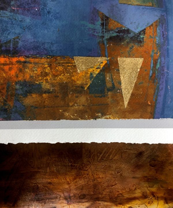
It came to me in the middle of the night - as these things often do - that to incorporate gold leaf into the finished print would neatly encapsulate some of the elements I am trying to express. Its application would obviously have to be done by hand with all its attendant imperfections and mistakes. Kintsugi - the Japanese art of patching broken ceramics with gold - shares its aesthetic with Wabi Sabi.
Gold leaf has been used - and continues to be used - in the art world for centuries and it’s reasonably easy to understand how the process might be realised when dealing with acrylic or oil paints. Less so with the digital print unfortunately. Digital inks are translucent and rely on a white substrate to give life to the colours. Backing them with gold leaf, I discovered, only serves to drain the energy out of the print. And so began hours and hours of research; research so absorbing and intense that I ended up drying out my eyeballs necessitating a break from the computer for three days. Research that led me down so many dead ends.
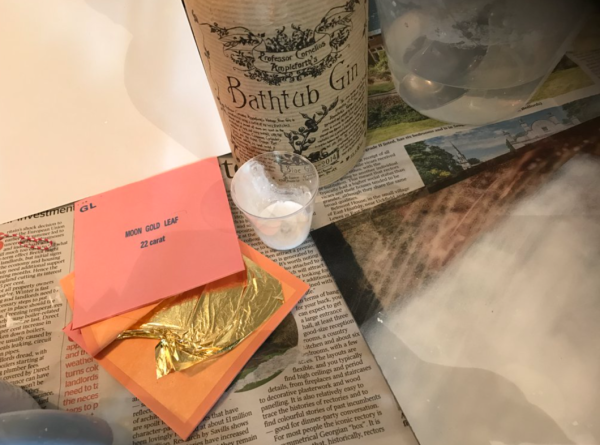
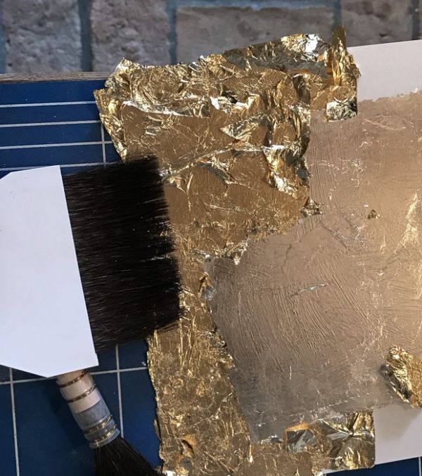
Eventually, after much tortured deliberation, I finally decided that printing on glass would be my best option. I then set about learning how to apply gold leaf and duly took myself off to the studios of the wonderfully enthusiastic Richard Walker for two days of intensive tuition in the gentle and surprisingly meditative art of glass gilding (verre eglomise). My objectives were less Gustav Klimt bling and more about learning to tone down the brightness of the gold and lessen its impact. It was an absolutely fascinating experience - not least because Richard’s wealth of creative ideas for manipulating the gilded surface so neatly reflected my own penchant for play and experimentation. I was particularly intrigued to discover that the size used in water gilding is a carefully measured combination of warm water, gelatine and ……gin! Gordons, Beefeater, Bombay Sapphire - he didn't exactly elaborate. But gin it definitely was. And a goodly slug of it too. One can’t help but be delighted by such serendipity.
I have completed my course and surrounded myself with all manner of gilding paraphernalia and the images have just been returned from brilliantly patient and understanding team at Metro Imaging in London having been printed onto museum glass. I shall try to decipher the notes made under Richard’s tutelage and with comic endeavour and misplaced confidence attempt to apply some gold leaf behind the highlights. It is a process fraught with impediments. Gold leaf, I have discovered, is as flighty as a feather and you may as well try to catch a sunbeam as retrieve an airborne scrap of gold. Richard told me he sacrificed two laptops before realising that displaced gold leaf was being sucked into his computer, shorting out the motherboard. Much care will be needed.
Whether or not my endeavours for this project will be successful remains to be seen. But who can fail to be seduced by names such as Moon Gold, Champagne Gold, Citron Gold and the like? The collection will be on show in a couple of weeks, thanks to Inside the Outside's kind invitation to participate in their upcoming 2016 exhibition in Nottingham. I console myself with the fact that if things don’t pan out the way I’d hoped, people will be too busy marvelling over John Blakemore’s beautiful work to notice, leaving me free to slope off and drown my sorrows with the leftover gin.
Other Posts...
LET US PLAY
Posted 29/06/22
play/pleɪ/ verb engage in activity for enjoyment and recreation rather than a serious or practical purpose. Every child is an artist. The problem is how to remain an artist once…
BAUHAUS AND BEYOND
Posted 21/04/19
The Bauhaus movement celebrated its centenary in 2019 and more than a century after its inception the influence lives on and continues to shape our concept of good, intuitive design. Founded in…
LOCATION, LOCATION, LOCATION
Posted 31/03/19
I caught the tail end of a brief discussion on social media a couple of days ago and it set my meandering thoughts along an investigative trajectory.Being called into question was the issue of a…

VISION 9
Posted 30/06/18
I have chosen to present my contribution to the upcoming joint exhibition at the Oxo Gallery in London in a slightly unconventional way. The images themselves represent a continuing fascination…
RETURNING TO ⌘P
Posted 29/06/17
Charlie Waite is one of many photographers to champion the importance and satisfaction to be gained from turning a digital file into a physical print. Such advocates are possibly less forthright about…
COMMITMENT
Posted 30/12/15
I have just watched a short film made about a photographer I greatly admire, Chris Tancock. His dedication, patience and commitment to his art are humbling to say the very…


